


Your product page is the final step before a purchase—get it wrong, and you lose the sale. A high-converting product page blends clear design, compelling copy, trust signals, and persuasive visuals. It should answer every question the shopper might have and remove friction from the buying process. Let’s explore 10 key elements to help you build product pages that convert.
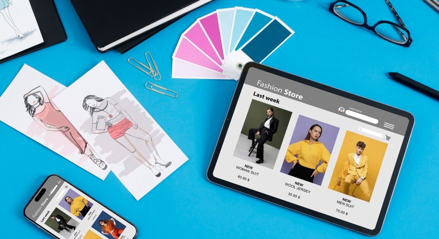
1. Use High-Quality Product Images
Visuals are everything. Use multiple high-resolution images from different angles, with zoom and lifestyle shots. Include photos of variants (like colors or sizes) to reduce confusion and increase engagement.
2. Write Clear and Persuasive Product Titles
Your title should be descriptive but not spammy. Include important keywords like color, material, or use case. Keep it concise while ensuring the product is easily understood at a glance.
3. Craft Compelling Product Descriptions
A great description highlights features and benefits. Don’t just say “cotton shirt”—explain that it’s “soft, breathable, and ideal for summer comfort.” Use bullet points for readability and include care instructions if needed.
4. Showcase Customer Reviews and Ratings
Display star ratings, review count, and user-generated reviews to build trust. Include filters (e.g., Most Helpful, With Photos) and allow customers to upload images or videos using the product.
5. Highlight Urgency and Scarcity
Phrases like “Only 3 left in stock” or countdown timers increase urgency. Limited-time offers and flash sale banners can push users to act faster and reduce hesitation.
6. Use Trust Badges and Guarantees
Include SSL security badges, “Free Shipping,” “100% Money Back Guarantee,” or “Safe Checkout” badges near the Add to Cart button. These reassure customers and reduce friction.
7. Include FAQs and Specifications
Answer common questions right on the product page. List technical specifications, size guides, return policies, shipping timelines, and anything else that might delay a decision.
8. Make CTAs Prominent and Sticky
Your “Add to Cart” button should be large, colorful, and always visible (use sticky CTA bars on mobile). The fewer clicks it takes to buy, the better.
9. Enable Variant Selection Intuitively
For products with sizes, colors, or materials, show options clearly. Use image swatches and auto-update the product photo based on selection to make the UX seamless.
10. Optimize for Mobile Conversion
Mobile users are the majority. Ensure images load fast, buttons are thumb-friendly, and the layout is compact but clear. Mobile-optimized product pages can double your conversion rate.
Conclusion
A high-converting product page is not just about looks—it’s about removing objections and making purchase decisions easy. With compelling content, visuals, and intuitive UX, you’ll turn more visitors into paying customers and reduce bounce rates significantly.